

Branding and packaging design concept. Completed by Todd Anderson Design.
Lukie’s was designed to have a beautiful shelf appearance with large photographic elements and clear typography, navigating the consumer to each of the products.


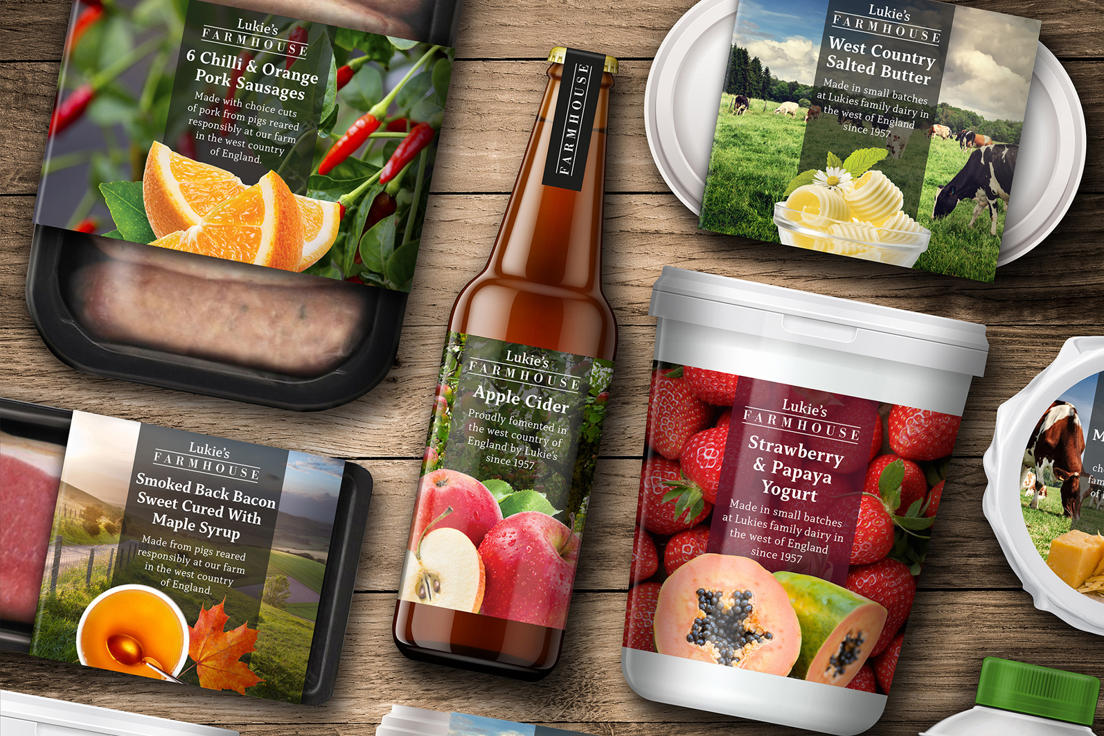
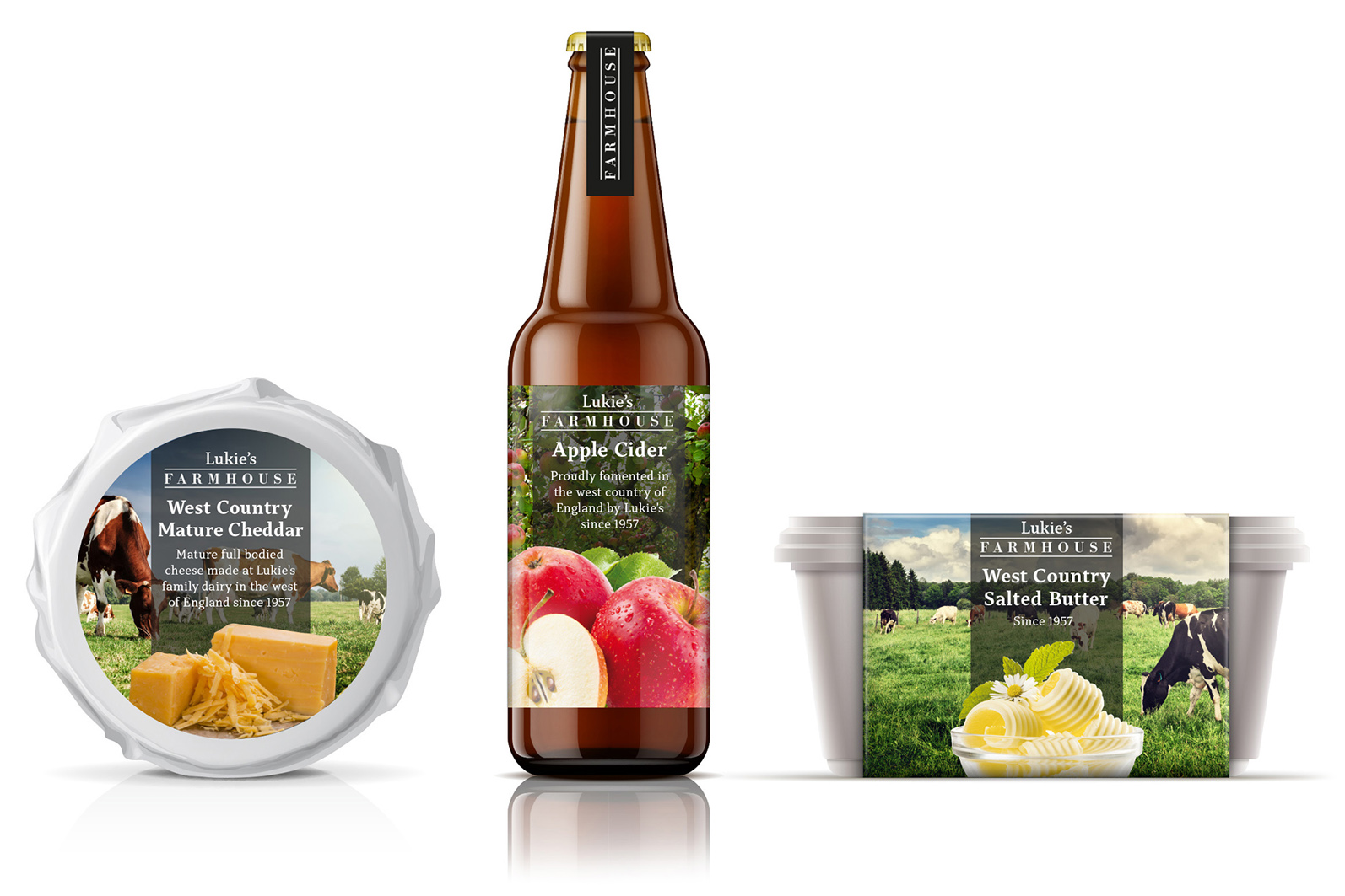
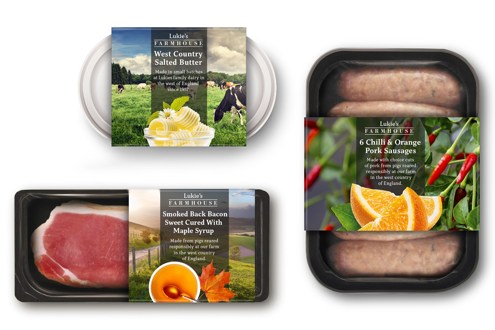
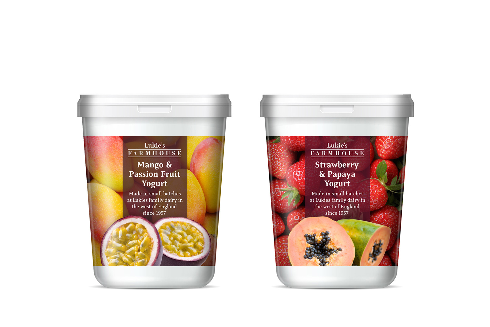
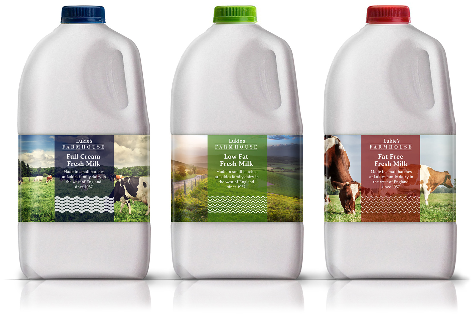
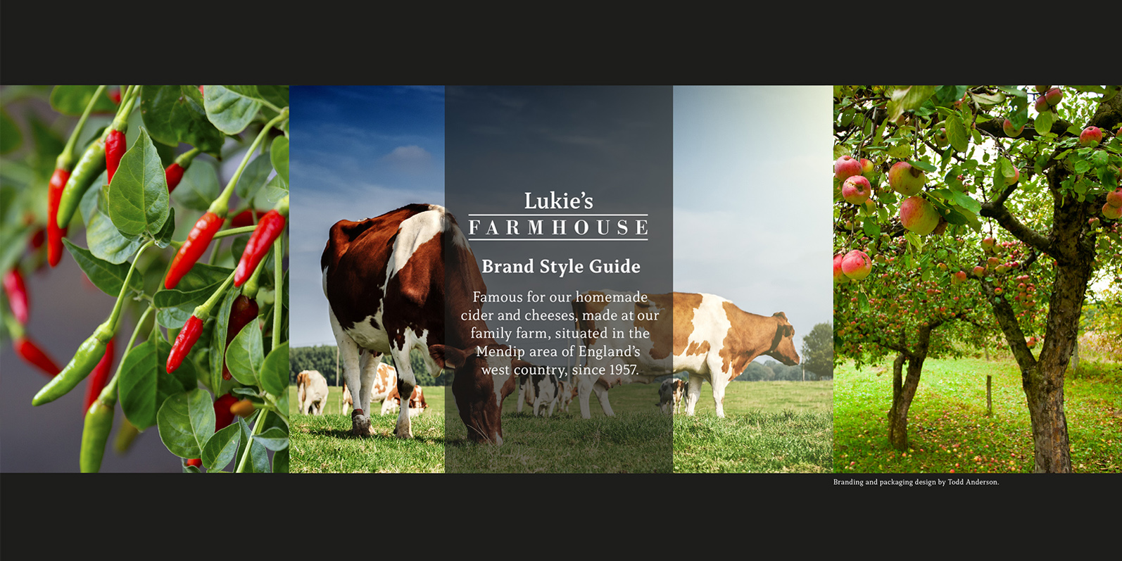
To accommodate the large and diverse product range, including meat, dairy and beverages, a clear visual identity system was created, using three distinct design elements that combine together. Starting with a large image to either set the tone or as a secondary ingredient element, then the typographic device backed with a colour tint for clarity and finally the image of the core ingredient or item.
The Lukies range was conceived as a large product range that would be produced in small batches and therefore, perfect for production using digital printing, ideal for low runs with no set up costs.


TODD ANDERSON
Branding and packaging design specialist / Creative Director
info@toddandersondesign.com
Make a free website with Yola