
Completed at CTTC Design in Collaboration with TJX Companies.
TJ Maxx are one of the largest clothing retailers in the United States. CTTC design have had a long standing relationship with the retailer, producing branding and packaging design for bath and body products, both in the United States and in the United Kingdom (TK Maxx). The Capewest brand was created exclusively for TJ Maxx by CTTC Design.


Marula is one of Africa’s best kept secrets, so it was important for the visual language of this project to be high-end. This was achieved by the choice of a clean typographic approach, using the san serif font Frutiger to give an elegant touch. Wholesome looking liquids were packaged in clear vessels, with the description of the product housed in a solid bar, foiled in gold.


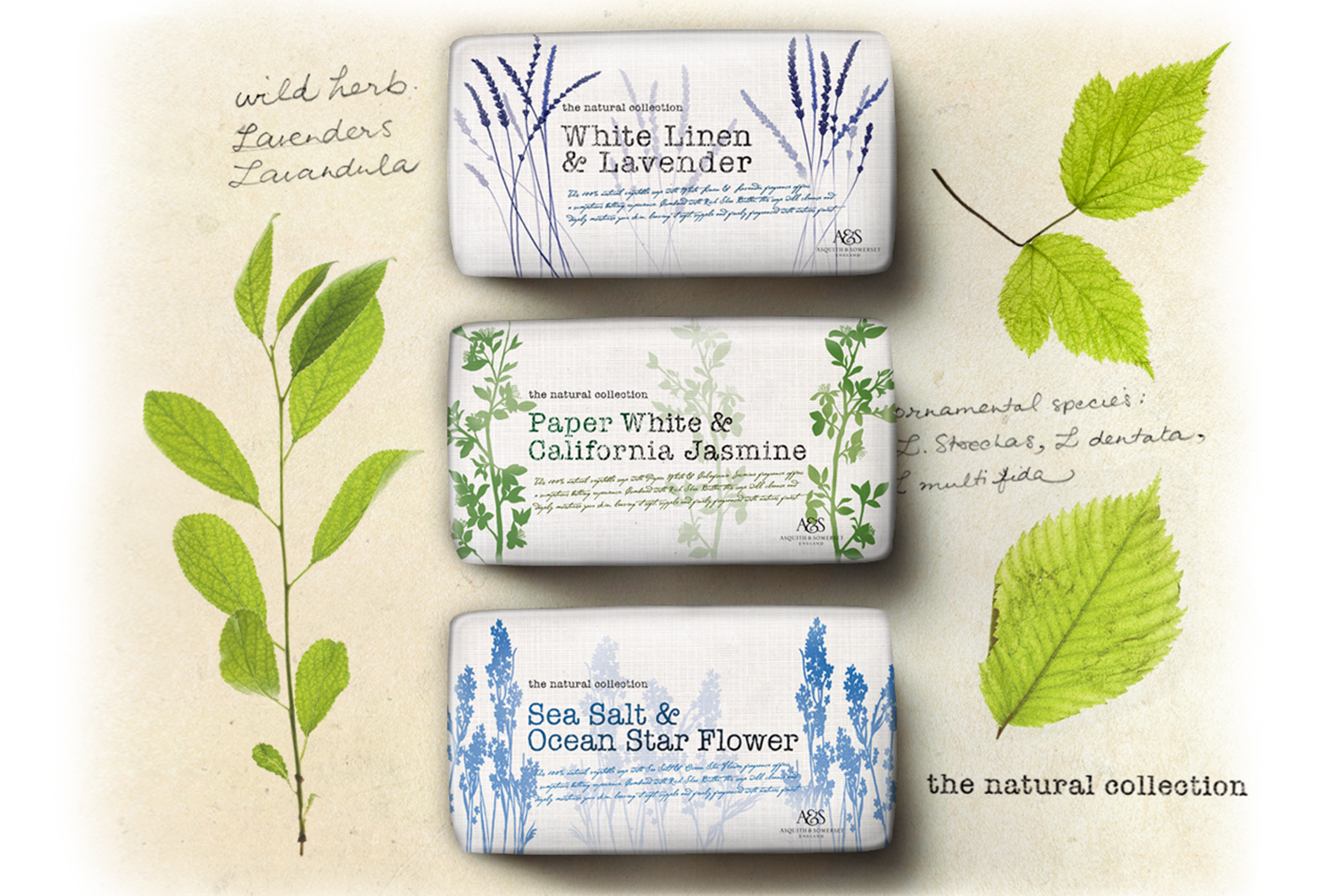
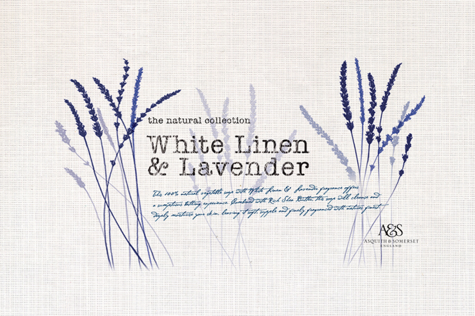
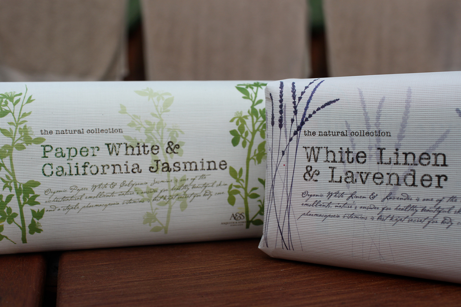
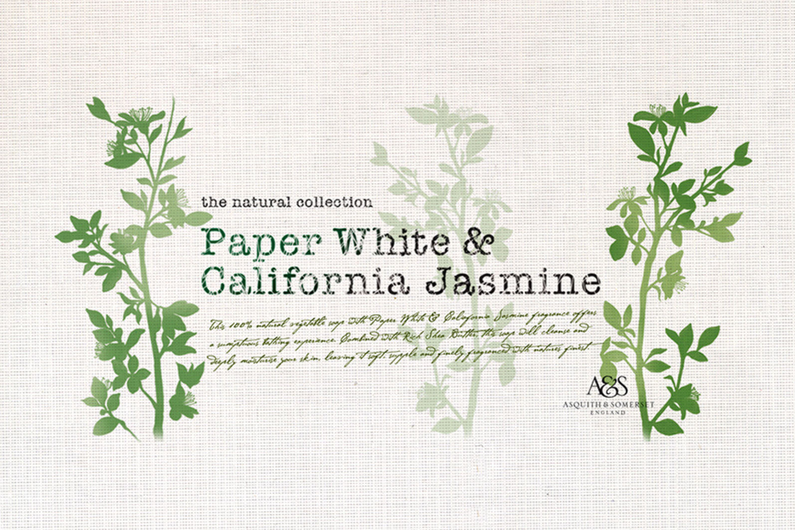
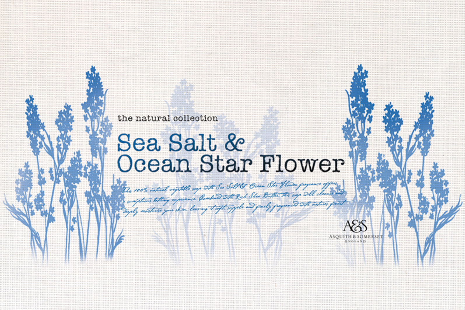
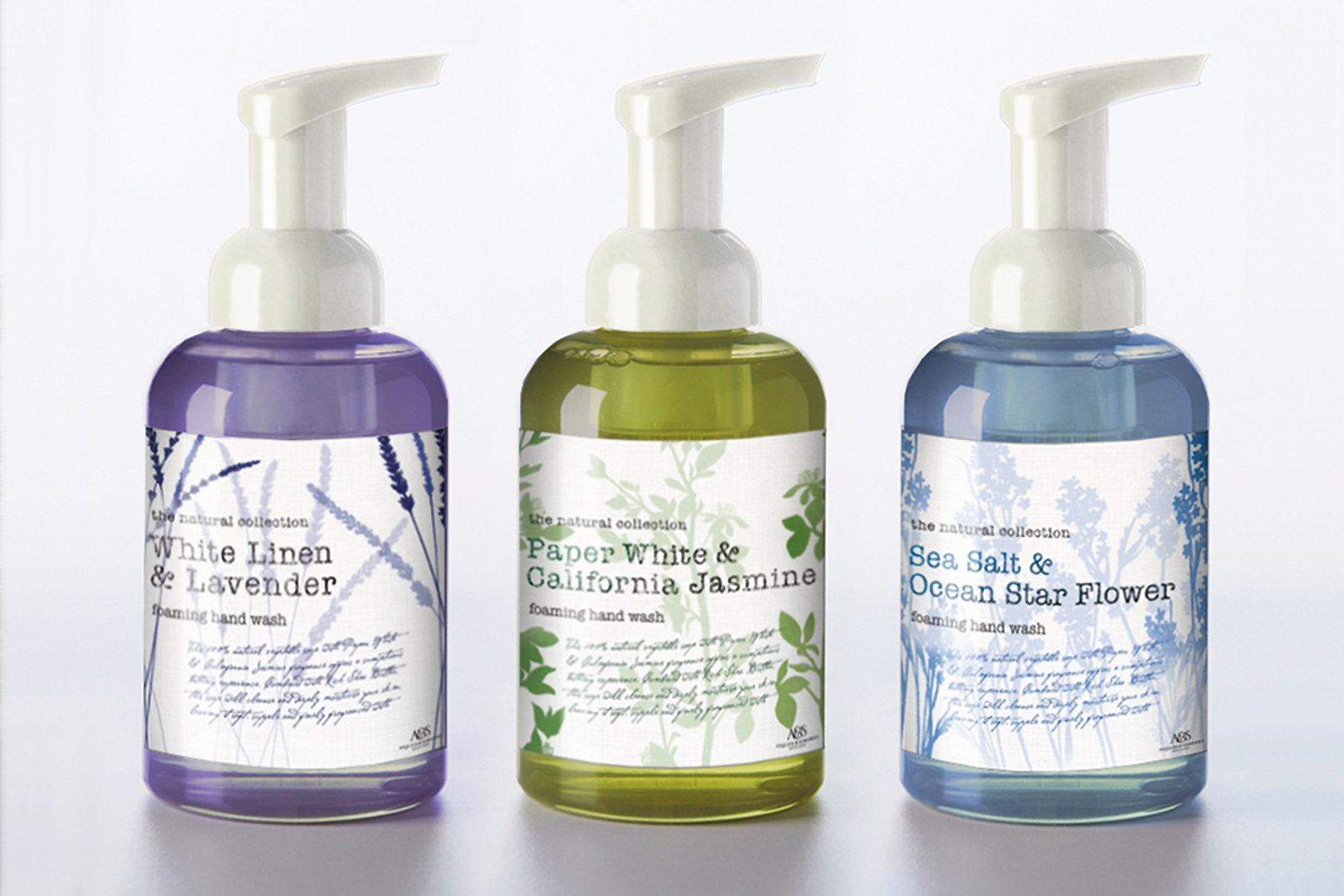
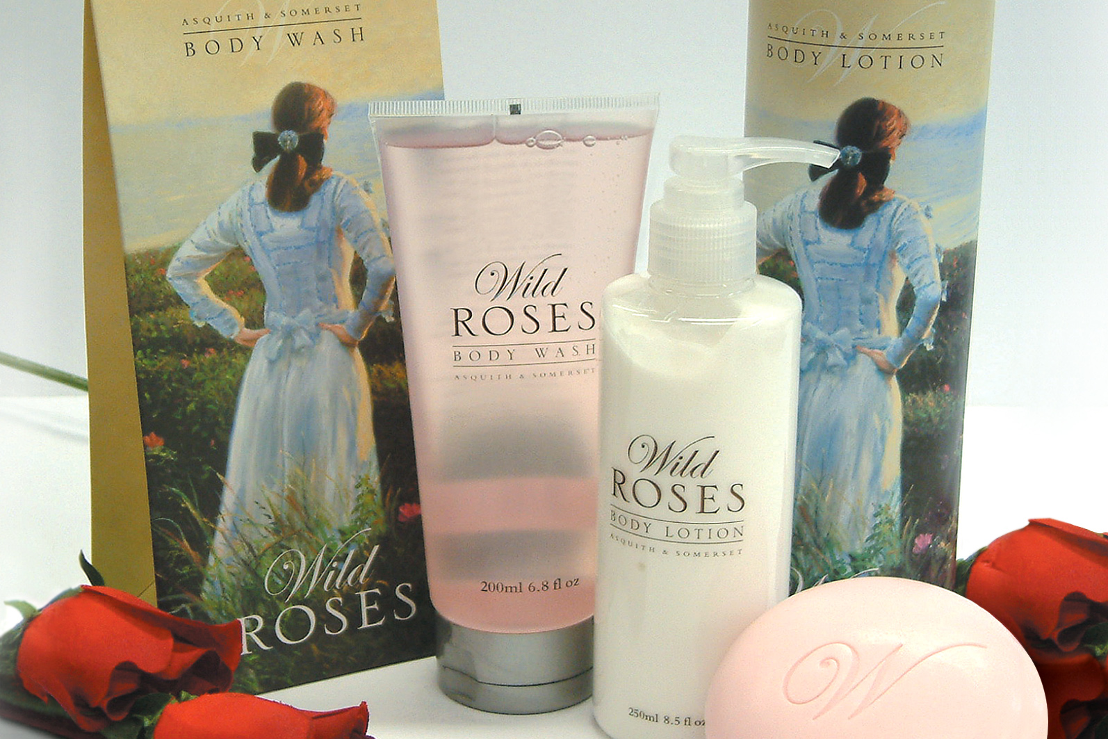
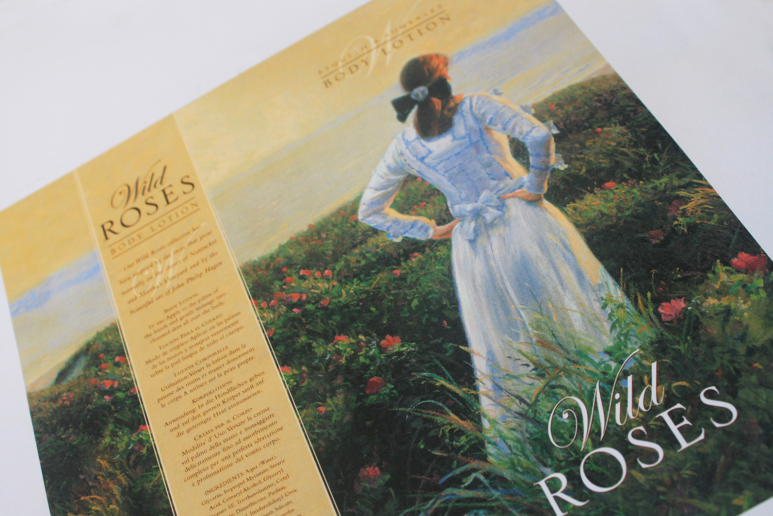
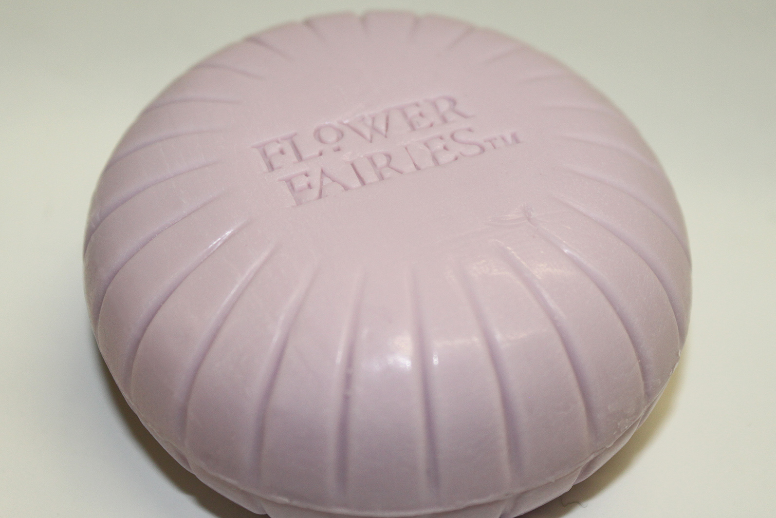
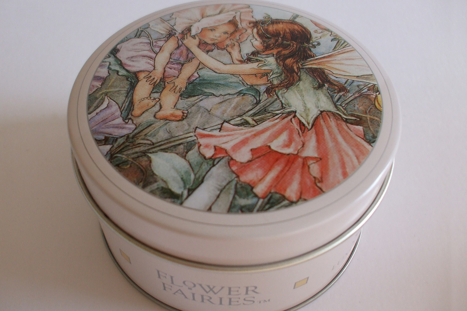
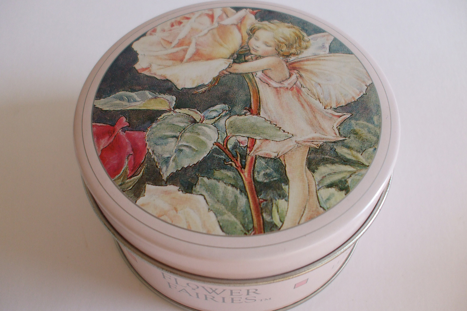
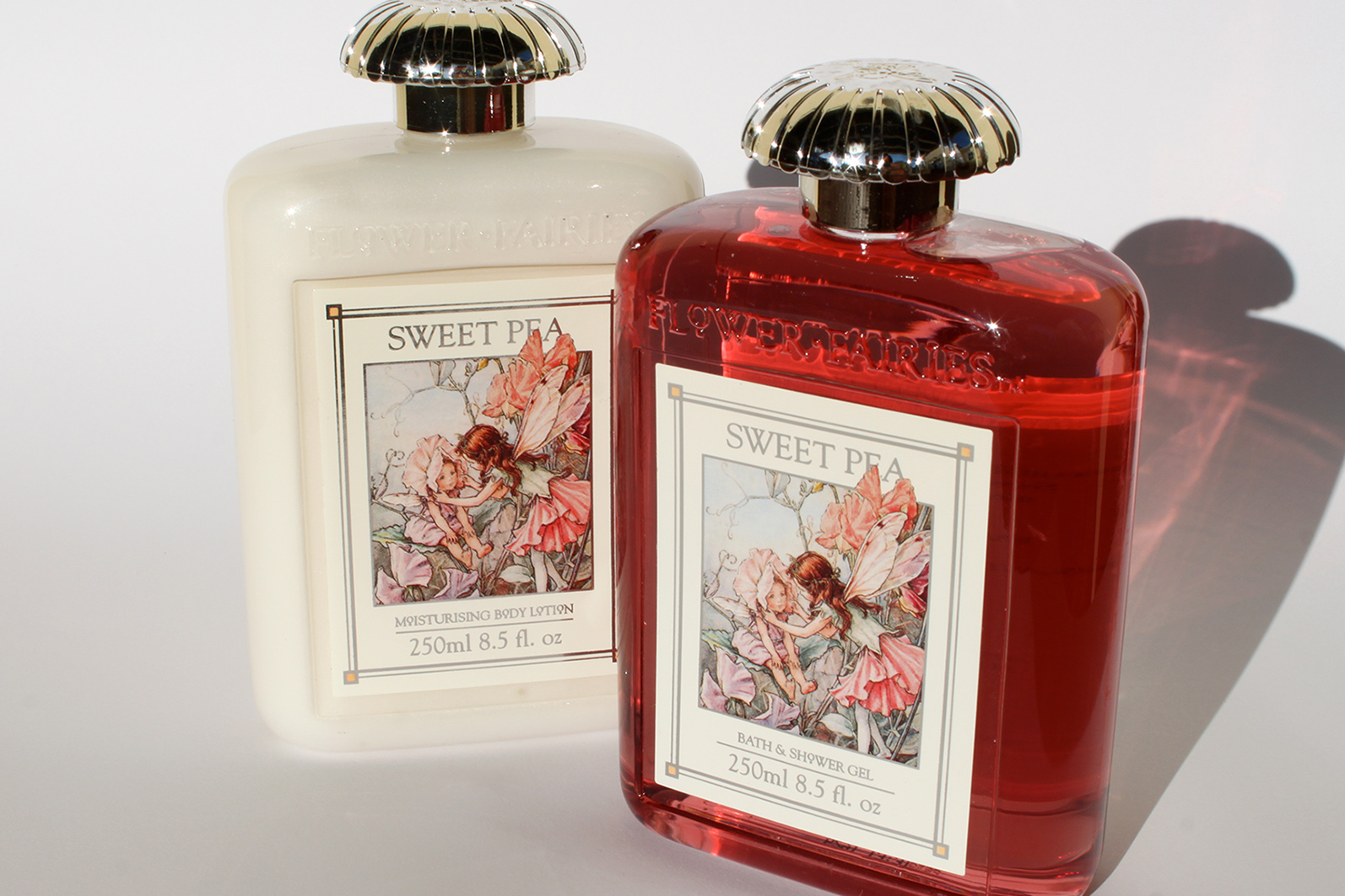
Striving to capture the romance of an artists notebook, the labels are designed to give the impression that the fragrance name, written on a torn piece of paper, is stuck down in a page, over the sketched illustrations and notes. See through vessels, with muted coloured fill, then complement the illustration.


Designed for the US and Canadian market, this spa range needed to communicate a feeling of the natural world. The base concept was to split the range into two definitive parts, The Sea - Hydrating, and The Earth - exfoliating. This was reinforced with the careful selection of colours used, tubes and jars that were transparent and screen printed to give them a beautifully tactile and quality finish. The brand icon too needed to fit within the ranges high end, luxury and modern aesthetic. Choosing a classic serif face, the inter character spacing was removed to a minimum of legibility.


Briefed on the theme of Watercolours/modern art, the design uses layers of coloured glass to create its painterly, eye-catching and unique abstract style. A black banner was added to the center of the vibrant visual to bring attention to the ranges fragrance description, Lemon & Verbena.


The Palm Beach range uses a bright colour palette to differentiate the fragrances, whilst the stark white illustration style sets a dramatic in store presence. The range consists of three boldly coloured salt scrubs, Sea Breeze (blue), Mango & Lime (green) Pink Grapefruit (pink).


INDEX
LithaFlora
Trepadora
Status
BBC Live Music Mobiles
HOME
PORTFOLIO
ABOUT
CONTACT
TODD ANDERSON
Branding and packaging design specialist /
Creative Director
With experience spanning over two decades, designing success for businesses and their products with thoughtful, innovative and sustainable design solutions.
info@toddanderson-design.com
Make a free website with Yola