
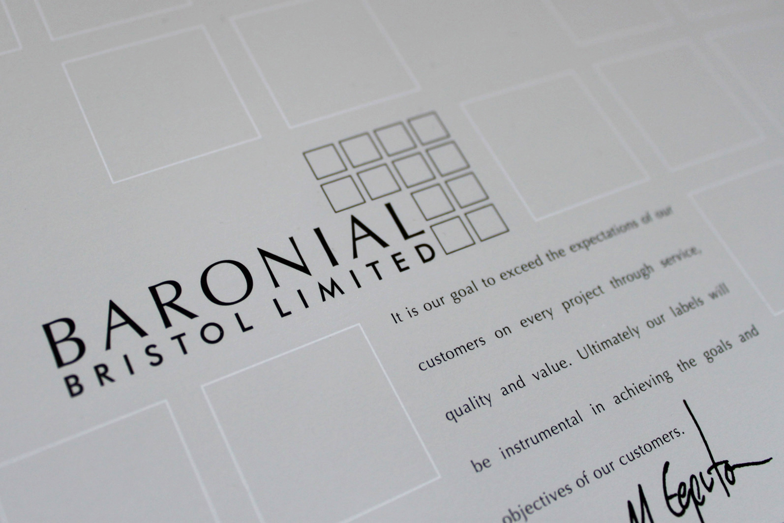
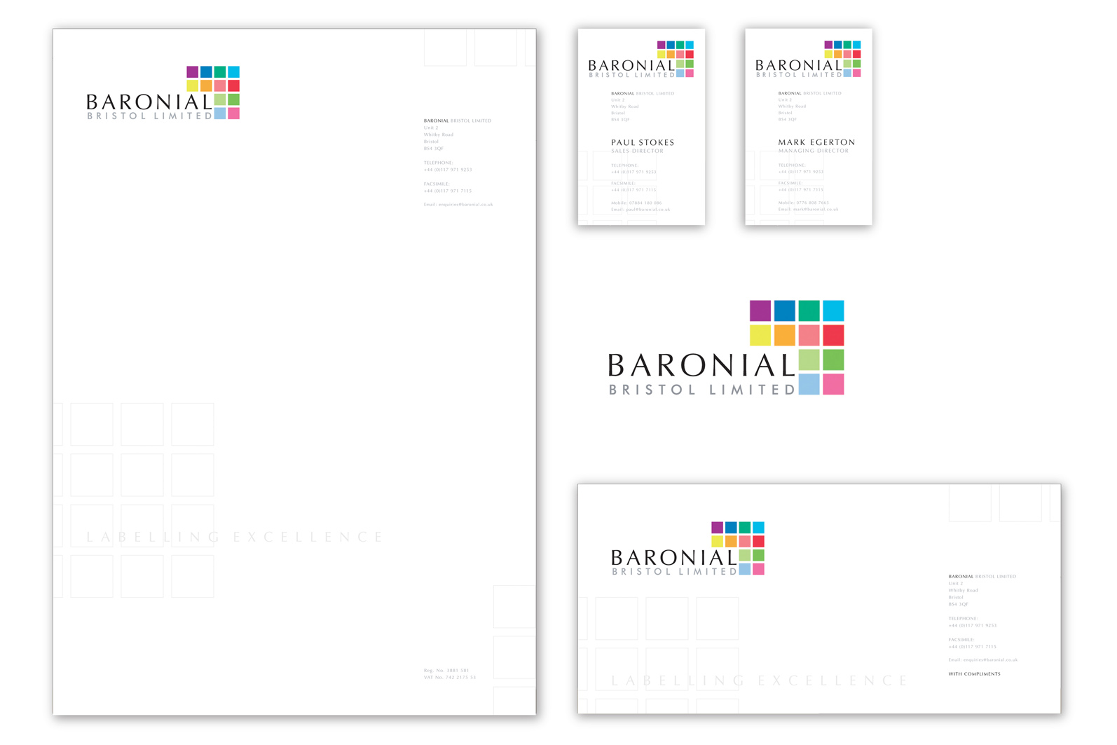
Branding, stationary design, artwork, style guide. Completed at Somerset Studios.
Anticipated to draw attention to the expert printing services they supply, the Baronial brand encompassed a background palette of cool grey and black alongside twelve carefully chosen and distinct colour blocks.


If required to work in black and white, the colour blocks were simply replaced with outline squares.
The font Optima was utilised for the company’s name to create an element of friendliness and was balanced well alongside the Futura face used for all other lettering.

TODD ANDERSON
Branding and packaging design specialist / Creative Director
info@toddandersondesign.com
Make a free website with Yola