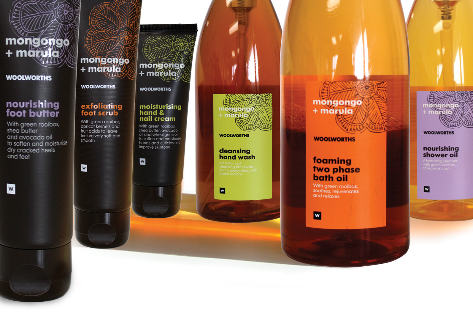
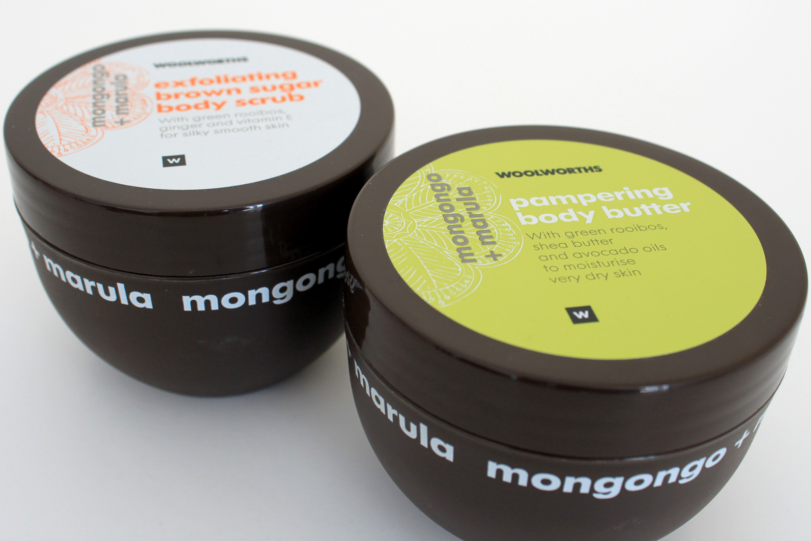
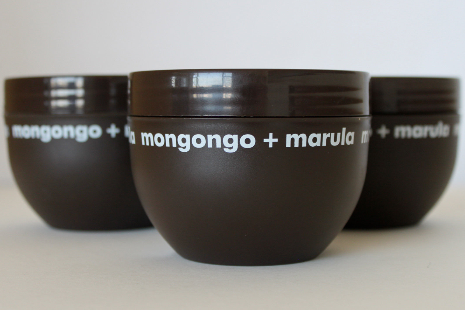
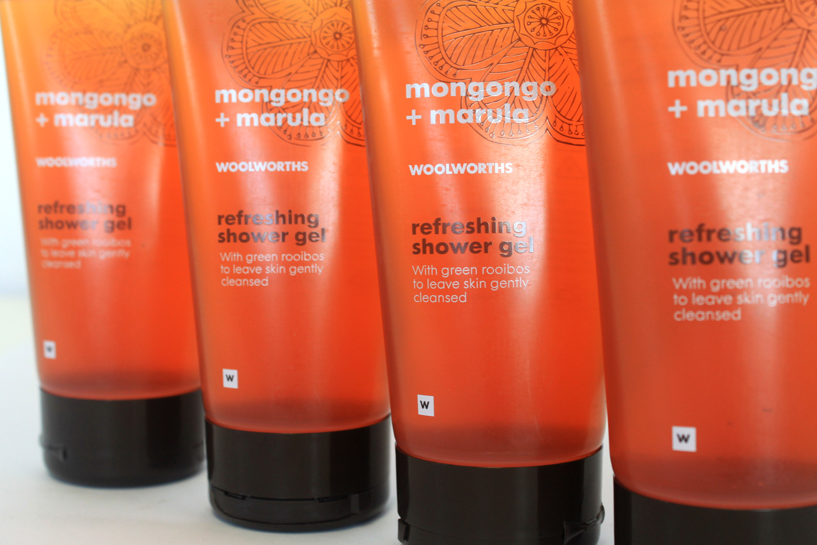
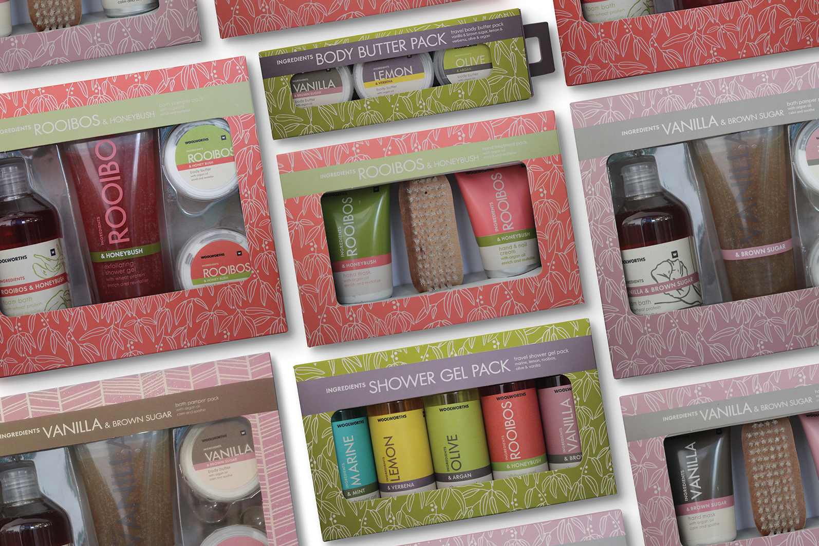
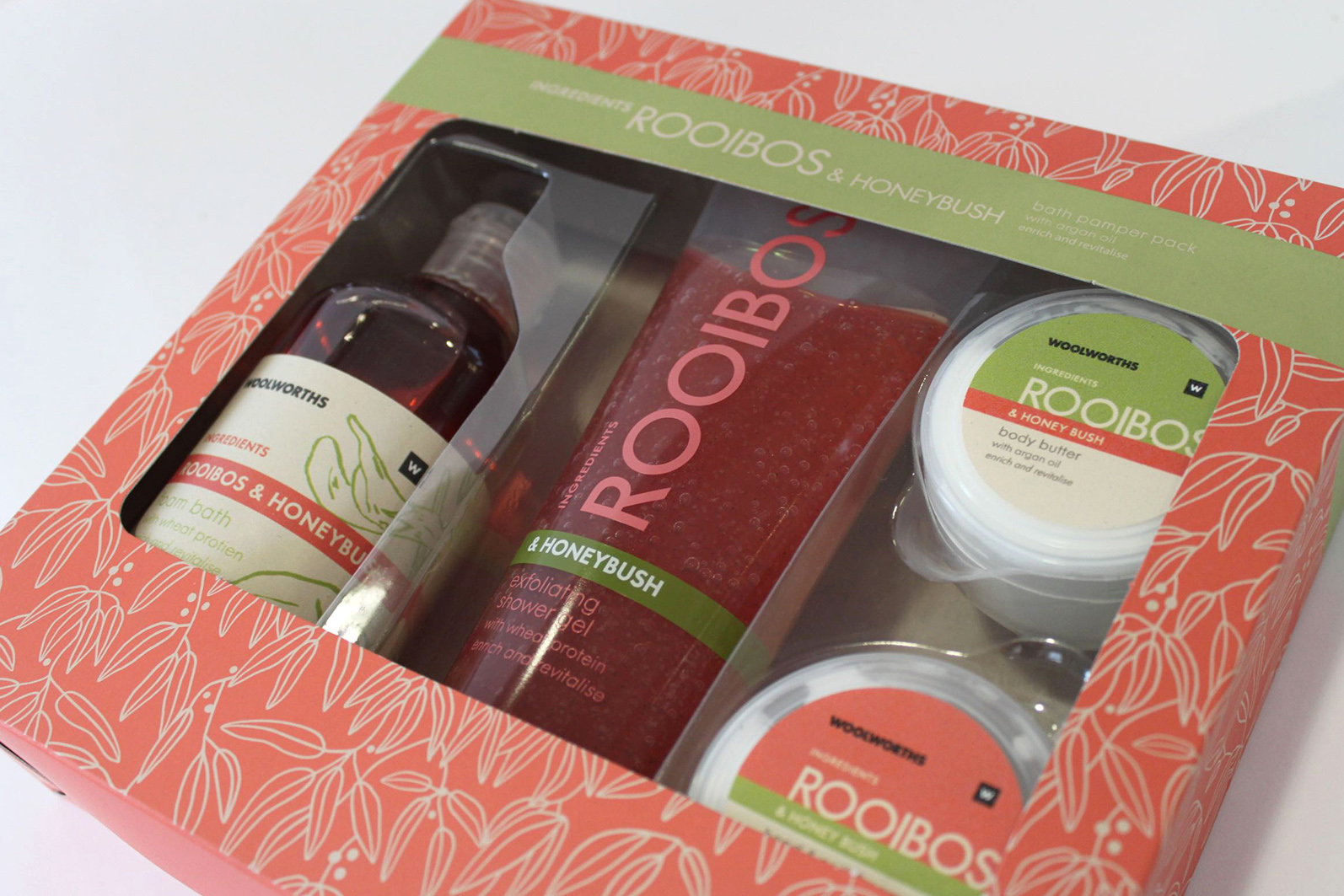
1 / 15 African Spa

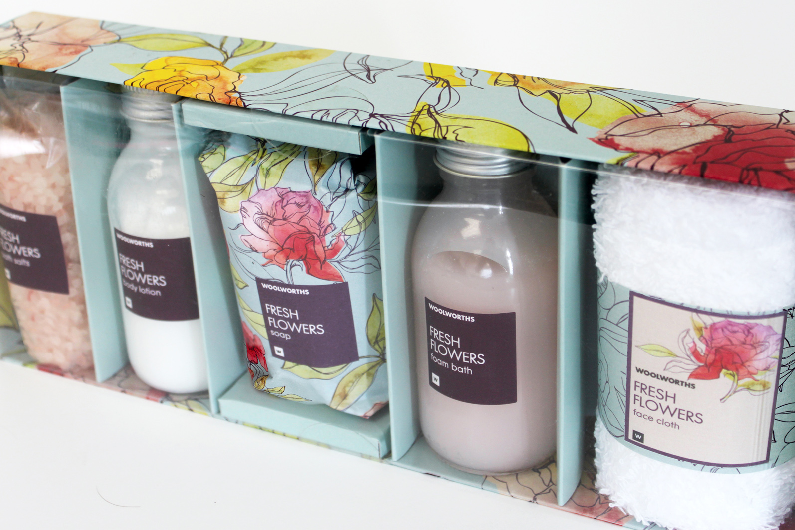
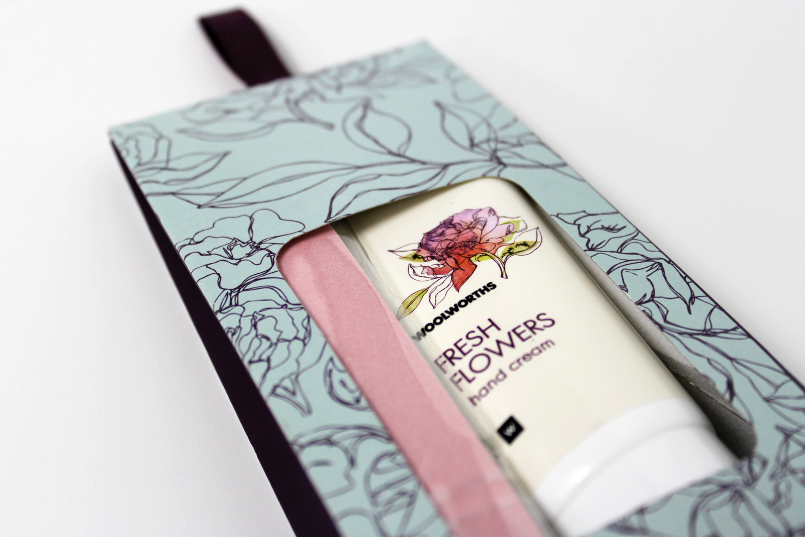
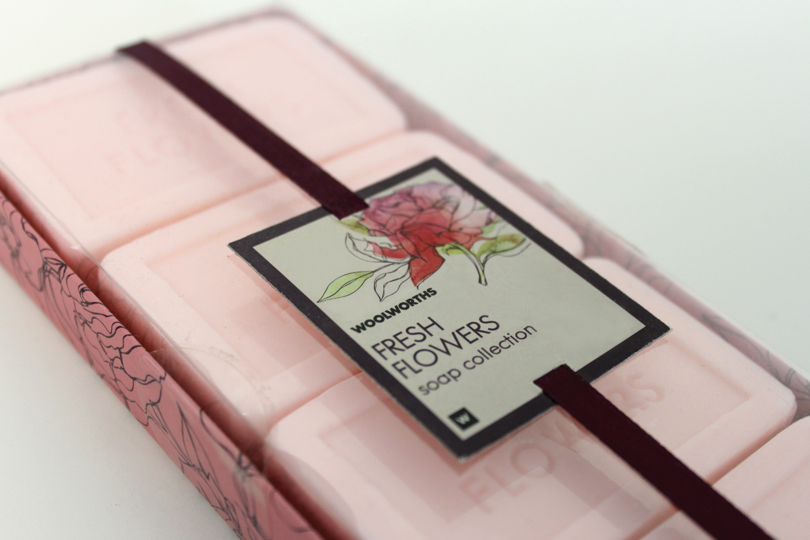
2 / 15 Fresh Flowers

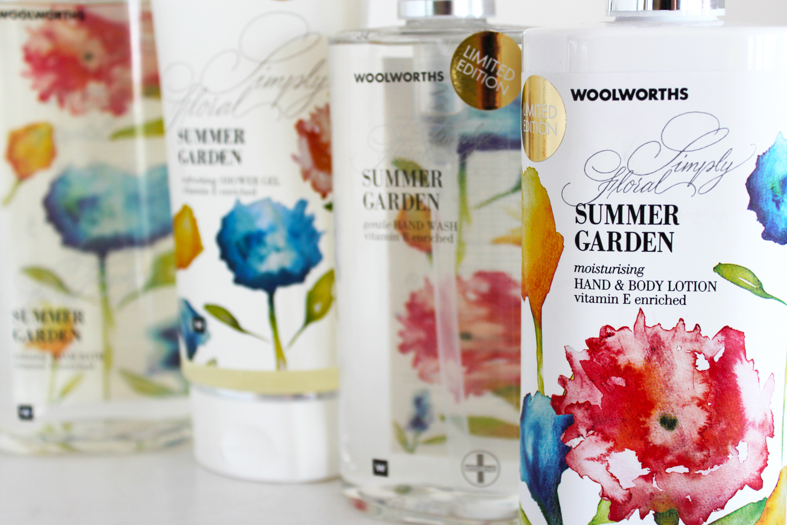
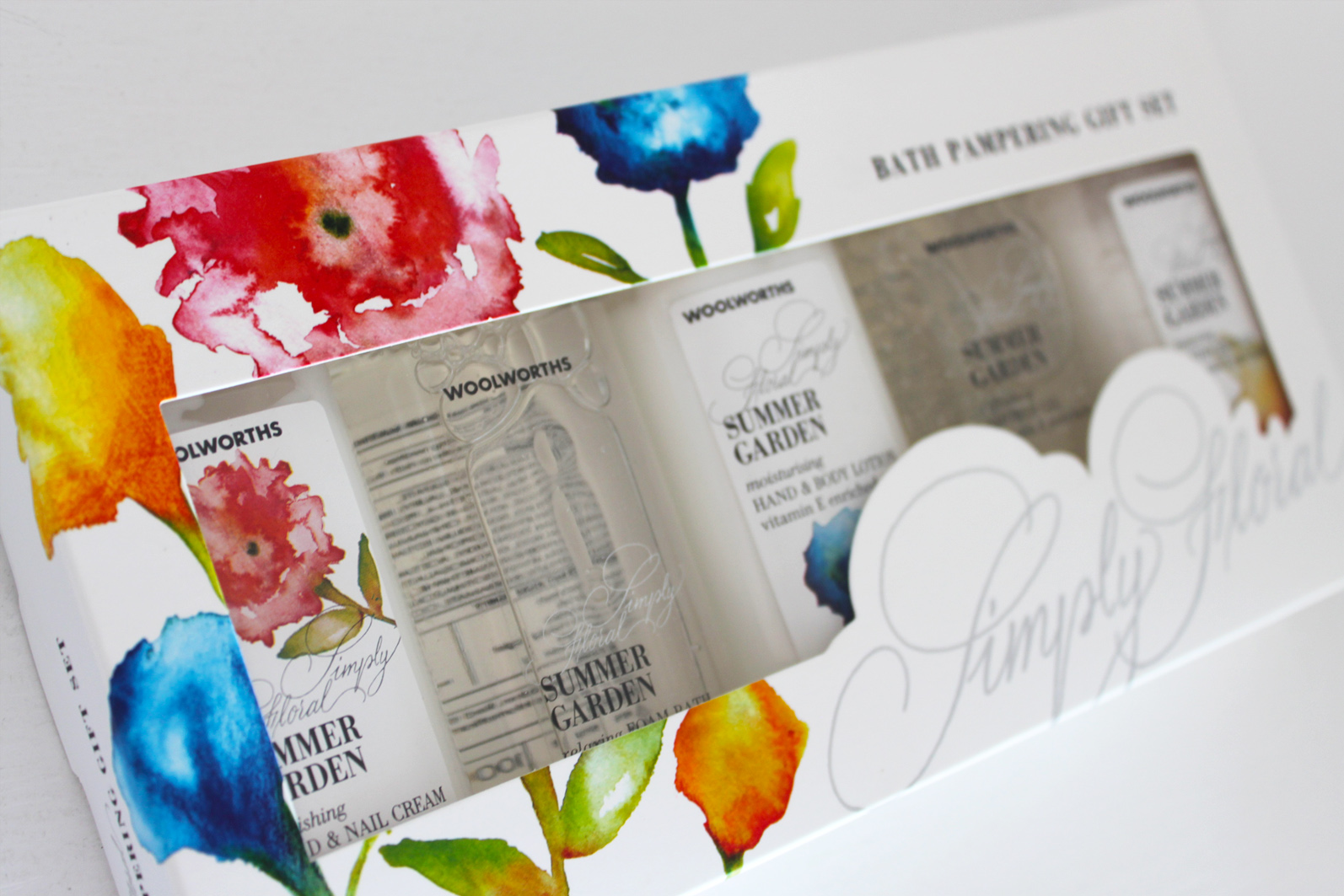
3 / 15 Summer Garden

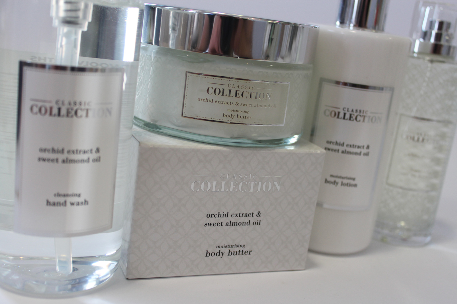
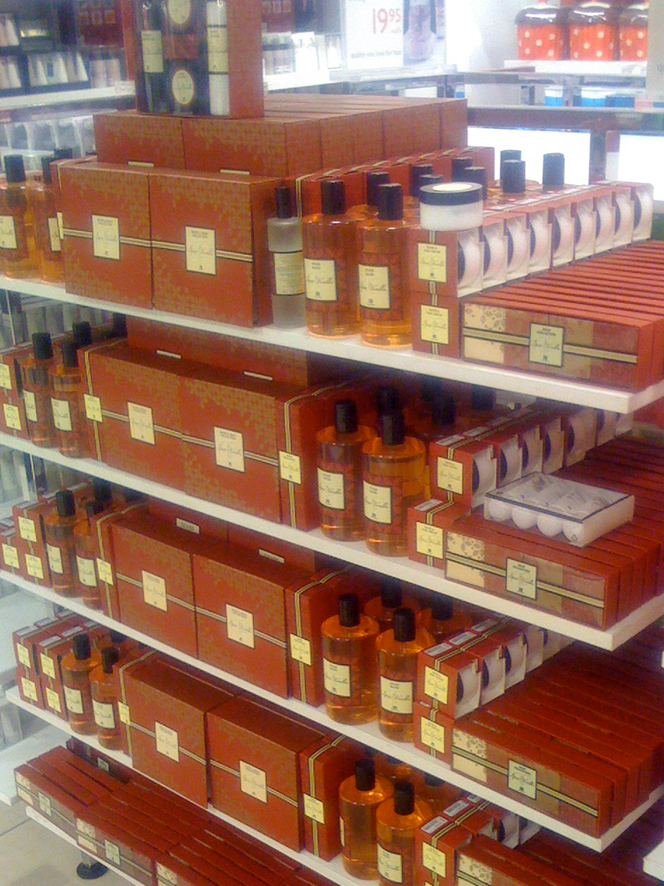
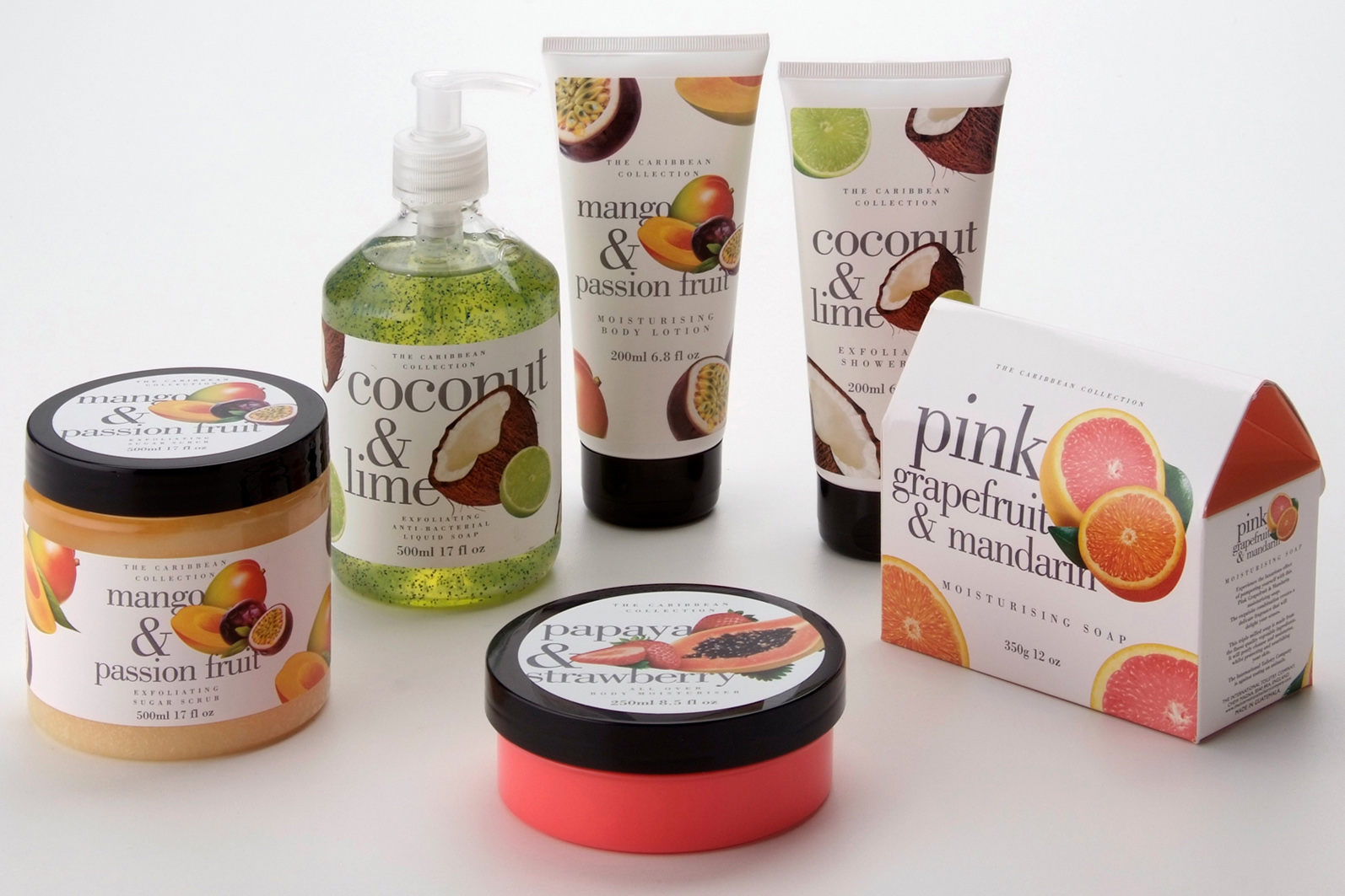
4 / 15 Classic Collection

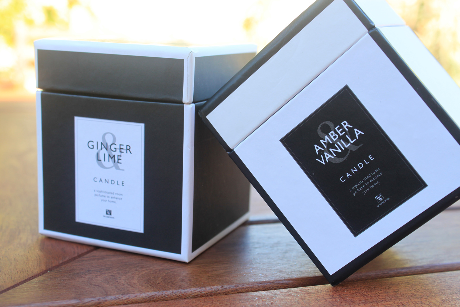
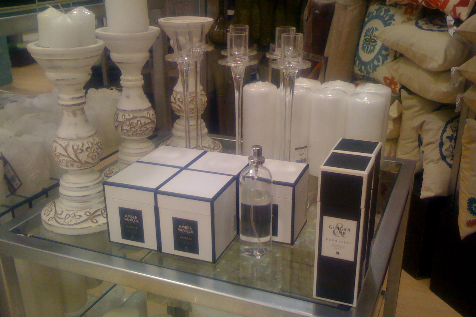
5 / 15 Woolworths Home

6 / 15 Benefits

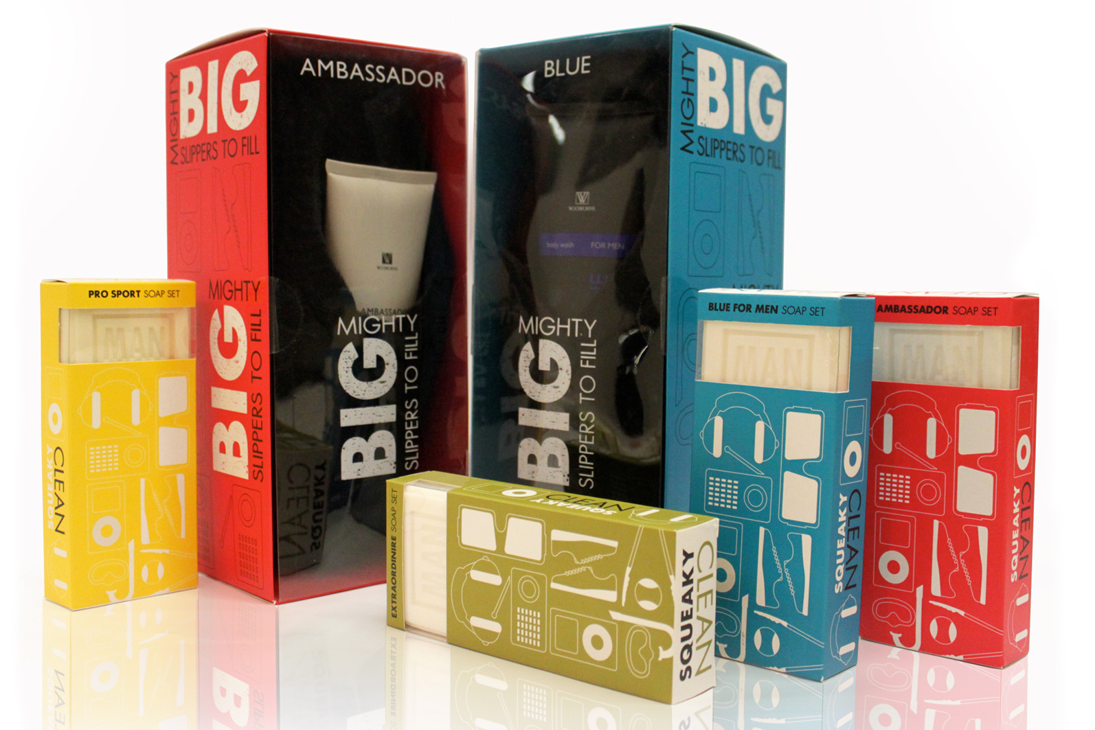
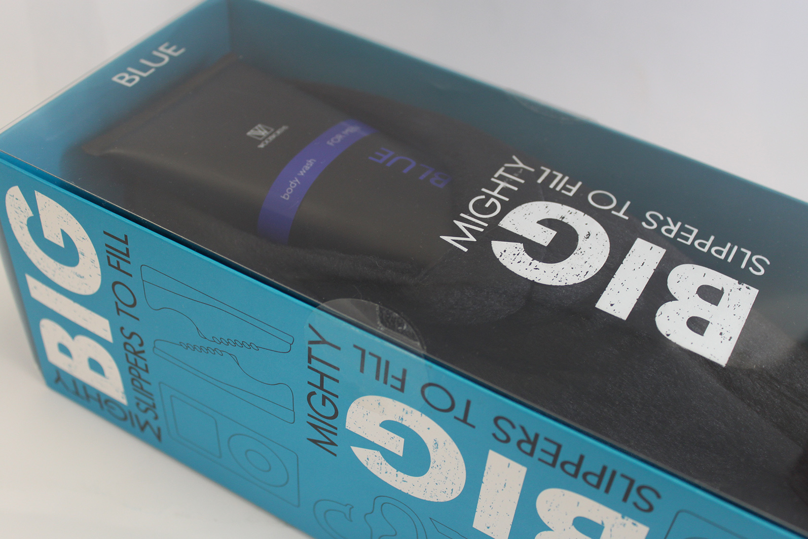
7 / 15 W Man

8 / 15 Mothersday

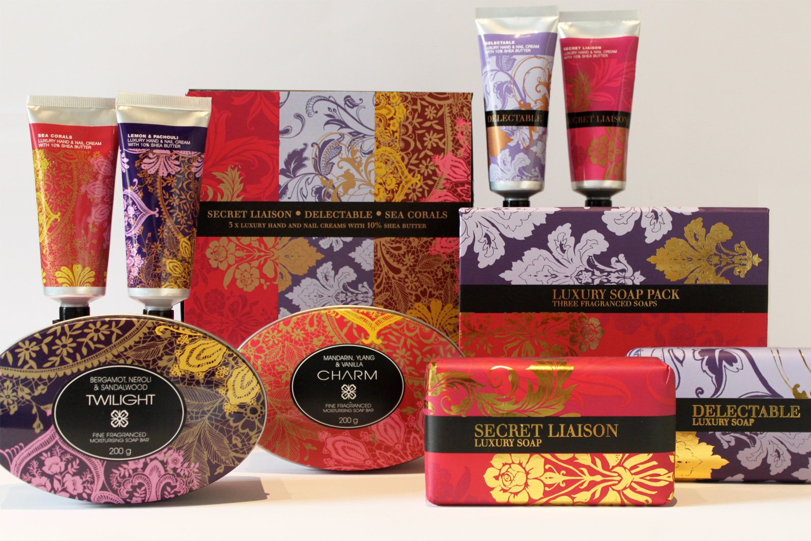
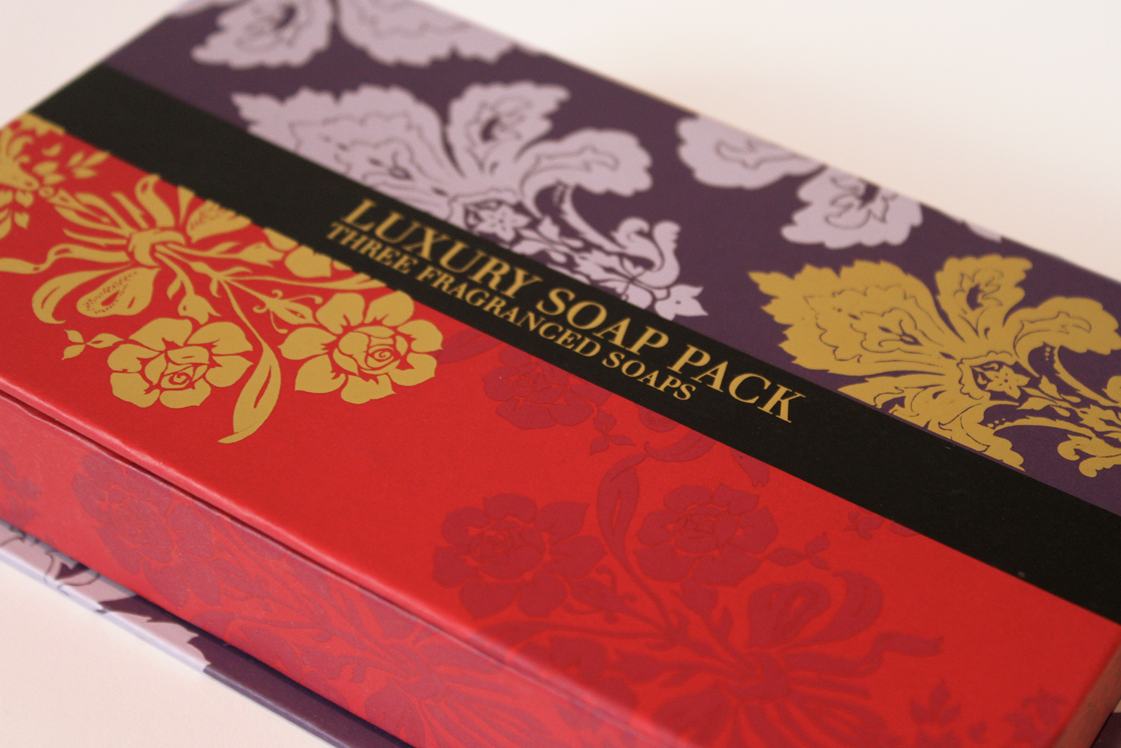
9 / 15 Opulence

10 / 15 Touch

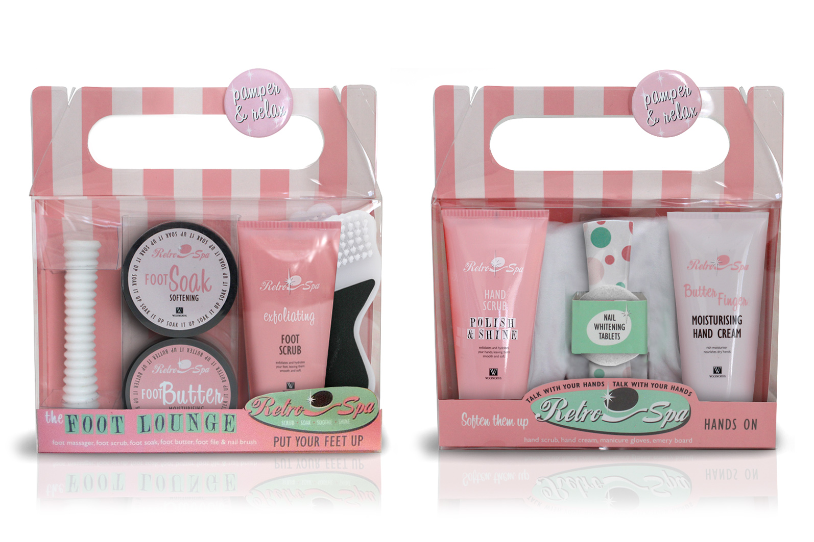
11 / 15 Retro Spa

12 / 15 Traditional Christmas

13 / 15 Soap Shop Takaway

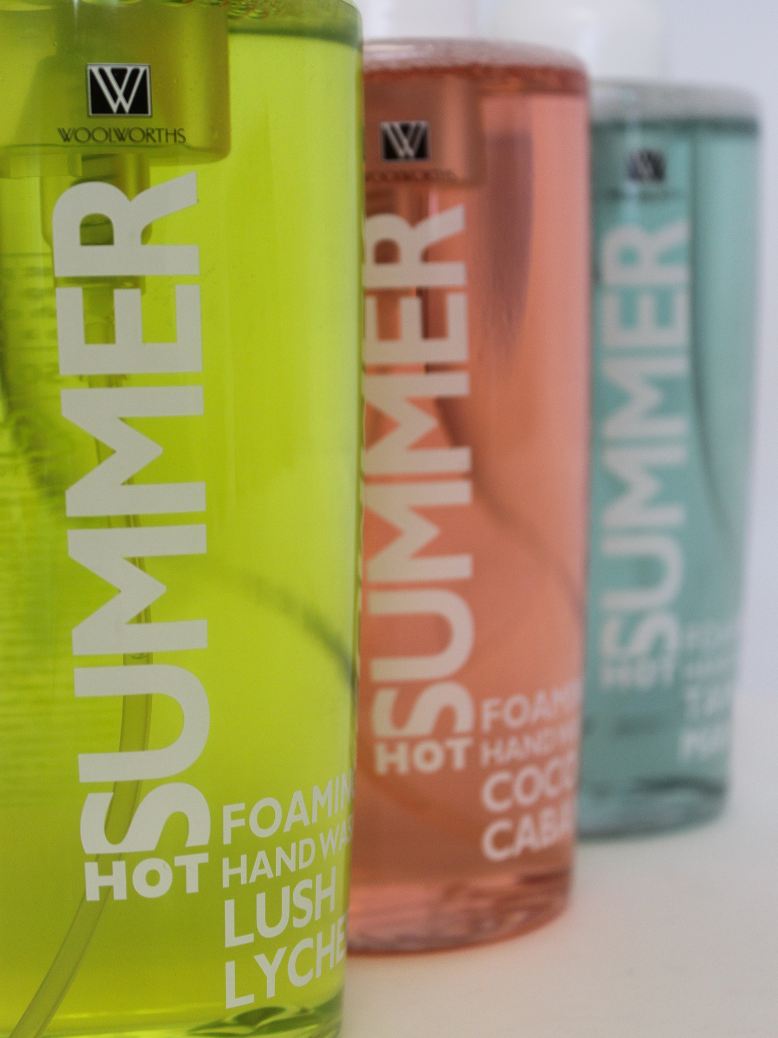
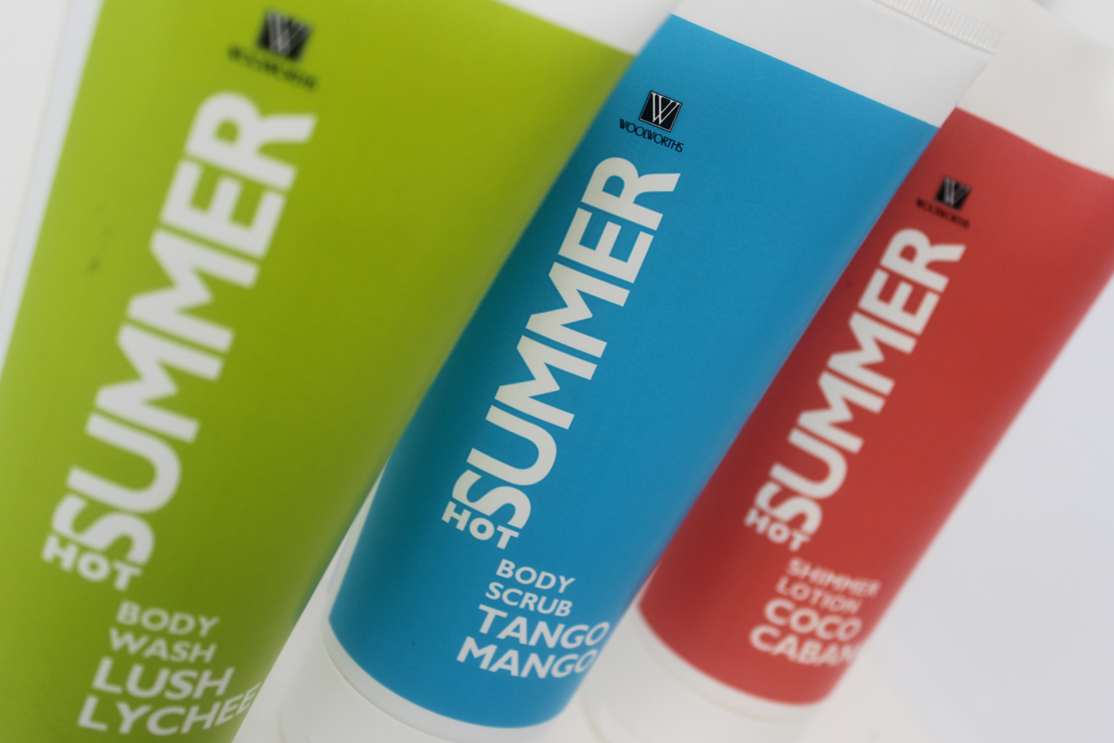
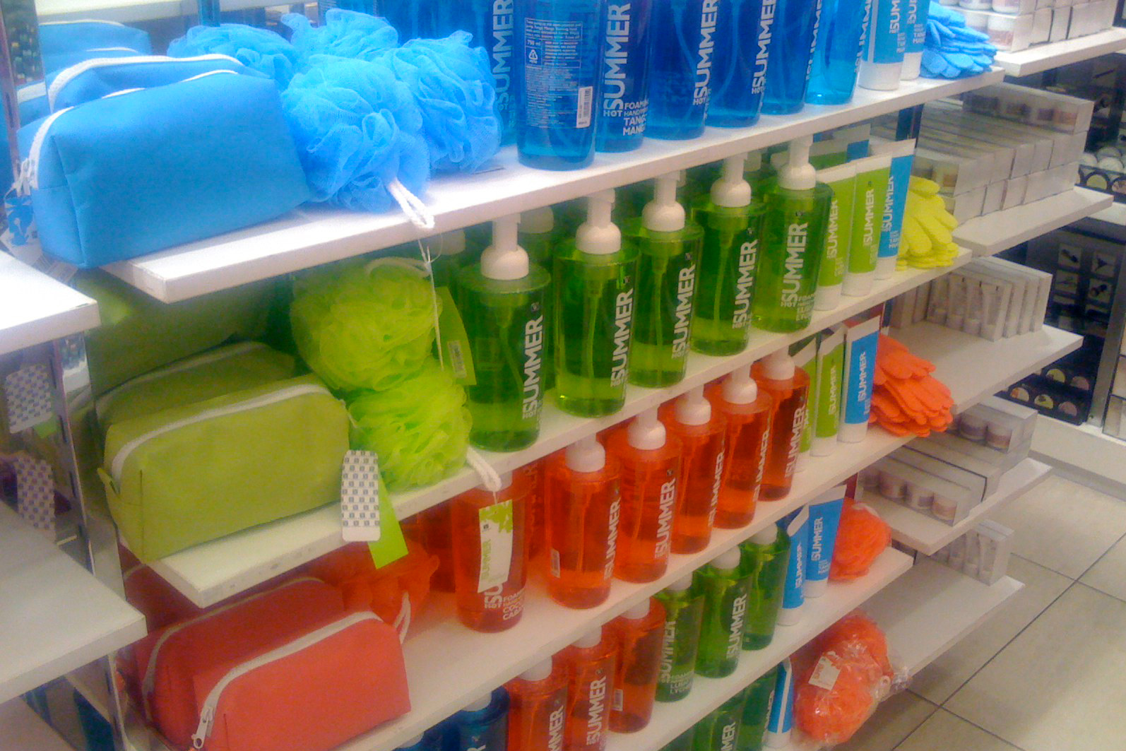
14 / 15 Hot Summer

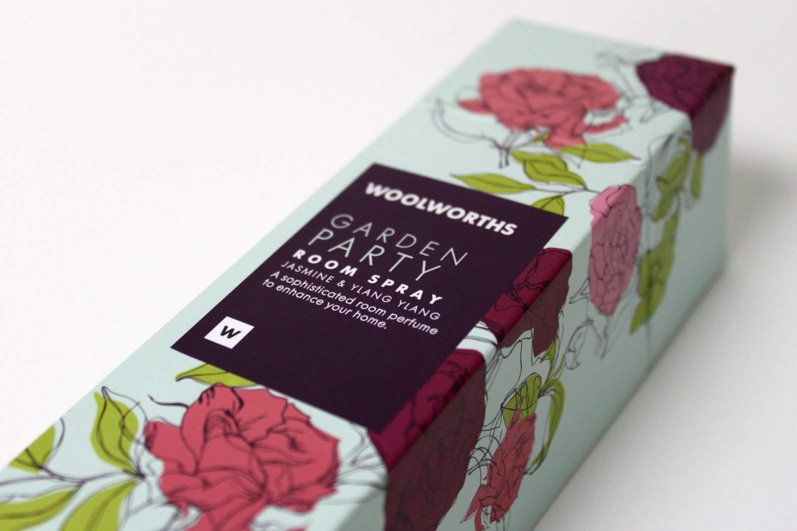
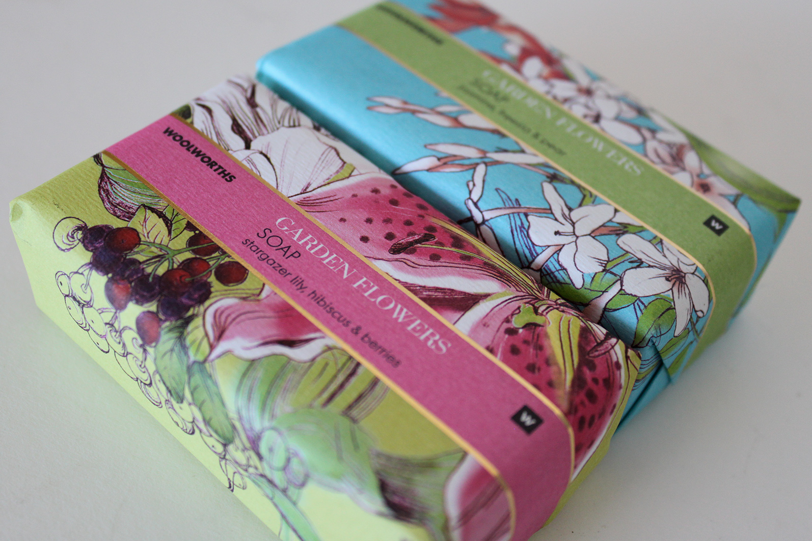
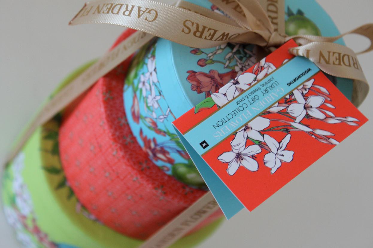
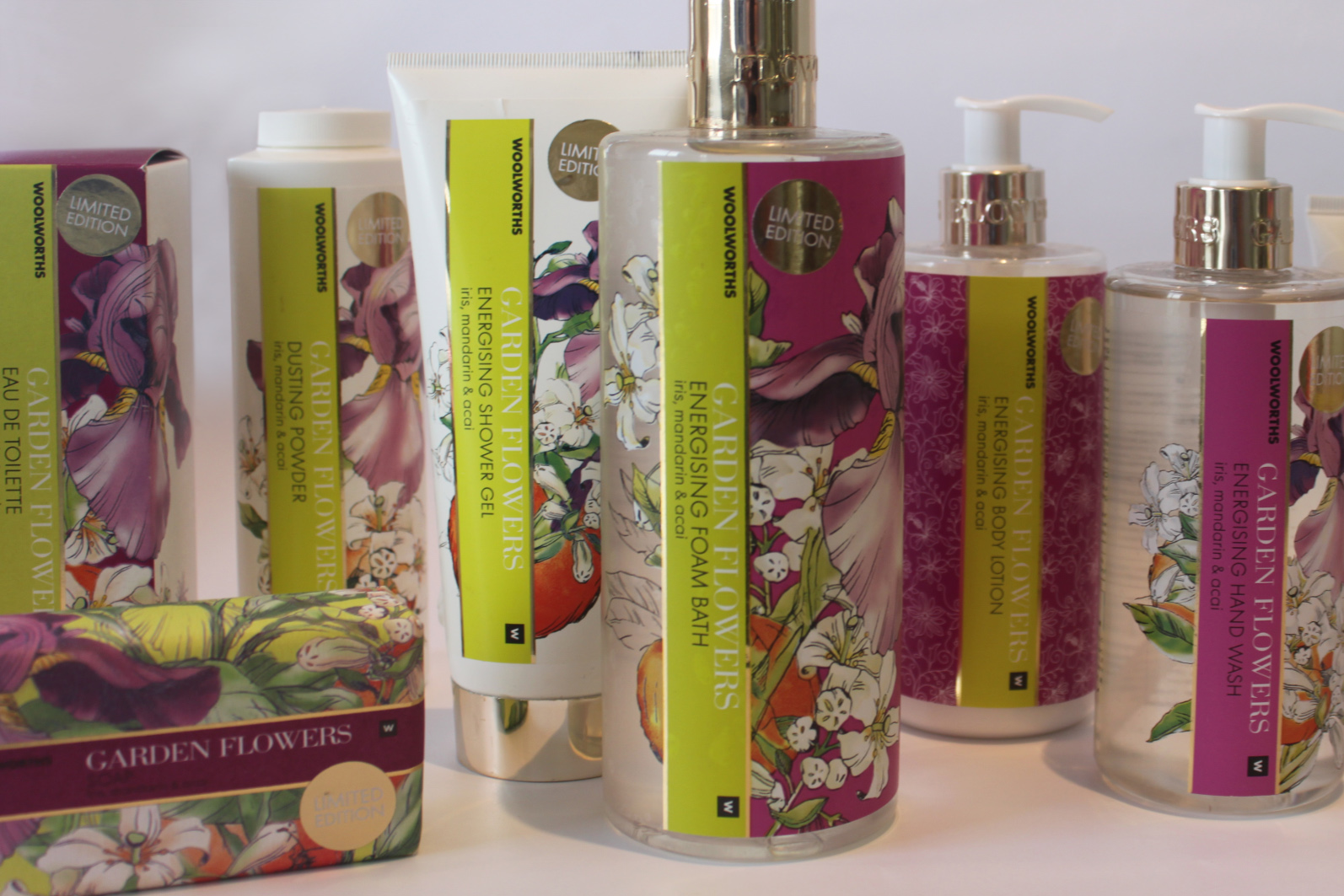
15 / 15 Garden Flowers